
Using R to analyse the Roche Antigen Rapid Test: How accurate is it?
(Image is from a different antigen test)
Many people are suspicious about the reliability of rapid self-tests, so I decided to check it out. For starters, I LOVE measurement. It is where learning from data starts, with technology and statistics involved. With this post, I’d like to join the swelling ranks of amateur epidemiologists :) I have spent a few years in a molecular biology lab, that should count for something right?
At home, we now have a box of the SARS-CoV-2 Rapid Antigen Test Nasal kit. The kit is distributed by Roche, and manufactured in South Korea by a company called SD Biosensor.
So how reliable is it? A practical approach is to compare it to the golden standard, the PCR test, that public health test centers use to detect COVID-19. Well, the leaflet of the kit describes three experiments that do exactly that! So I tracked down the data mentioned in the kit’s leaflet, and decided to check them out.
But before we analyze the data, you want to know how they were generated, right? RIGHT? For this we use cause-effect diagrams (a.k.a. DAGs), which we can quickly draw using DAGitty.
A causal model of the measurement process
The cool thing about DAGitty is that we can use a point-n-click interface to draw the diagram, and then export code that contains an exact description of the graph to include in R. (You can also view the graph for this blog post at DAGitty.net):
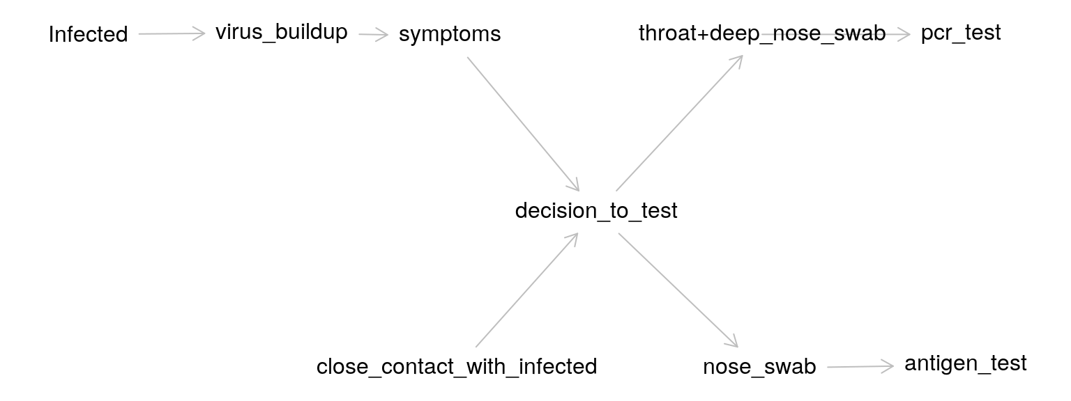
The graph is based on the following description of the various cause-effect pairs:
It all starts with whether someone is infected. After infection, virus particles start to build up. These particles can be in the lungs, in the throat, nose etc. These particles either do or do not cause symptoms. Whether there are symptoms will likely influence the decision to test, but there will also be people without symptoms that will be tested (i.e. if a family member was tested positive).
In the experiments we analyze, two samples were taken, one for the PCR test and one for the antigen test. The way the samples were taken differed as well: “shallow” nose swabs for the rapid antigen test, and a combination of “deep” nose and throat swabs for the PCR test.
Now that we now a bit about the measurement process, lets look at how the accuracy of the antigen test is quantified.
Quantifying the accuracy of an COVID-19 test
The PCR test result serves as the ground truth, the standard to which the antigen test is compared. Both tests are binary tests, either it detects the infection or it does not (to a first approximation).
For this type of outcome, two concepts are key: the sensitivity (does the antigen test detect COVID when the PCR test has detected it) and specificity of the test (does the antigen test ONLY detect COVID, or also other flu types or even unrelated materials, for which the PCR test produces a negative result).
The leaflet contains information on both.
- Sensitivity 83.3% (95%CI: 74.7% - 90.0%)
- Specificity 99.1% (95%CI: 97.7% - 99.7%)
But what does this really tell us? And where do these numbers come from?
Before we go to the data, we first need to know a bit more detail on what we are actually trying to measure, the viral load, and what factors influence this variable.
The dataset: results from the three Berlin studies
Now that we have some background info, we are ready to check the data!
As mentioned above, this data came from three experiments on samples from in total 547 persons.
After googling a bit, I found out that the experiments were performed by independent researchers in a famous University hospital in Berlin, Charité. After googling a bit more and mailing with one of the researchers involved, Dr. Andreas Lindner, I received a list of papers that describe the research mentioned in the leaflet (References at the end of this post).
The dataset for the blog post compares nasal samples tested with the Roche Antigen test kit, to PCR-tested nasopharyngeal plus oropharyngeal samples taken by professionals.
This blog post is possible because the three papers by Lindner and co-workers all contain the raw data as a table in the paper. Cool!
Unfortunately, this means the data is not machine readable. However, with a combination of manual tweaking / find-replace and some coding, I tidied the data of the three studies into a single tibble data frame. You can grab the code and data from my Github.
UPDATE: Rein Halbersma showed me how to use web scraping to achieve the same result, with a mere 20 lines of code of either Python or R! Cool! I added his scripts to my Github as well, go check them out, I will definitely go this route next time.
# creates df_pcr_pos
source("sars_test/dataprep_roche_test.R")

# creates df_leaflet
source("sars_test/dataprep_roche_test_leaflet.R")

# see below
source("sars_test/bootstrap_conf_intervals.R")
The dataset df_pcr_pos contains, for each PCR positive patient:
ct_valueviral_loaddays_of_symptomsmm_value(Result of a nasal antigen test measurement, 1 is positive, 0 is negative)
To understand the PCR data, we need to know a bit more about the PCR method.
The PCR method
The PCR method not only measures if someone is infected, it also provides an estimate of the viral load in the sample. How does this work? PCR can amplify, in so-called cycles, really low quantities of viral material in a biological sample. The amount of cycles of the PCR device needed to reach a threshold of signal is called the cycle threshold or Ct value. The less material we have in our sample, the more cycles we need to amplify the signal to reach a certain threshold.
Because the amplification is an exponential process, if we take the log of the number of virus particles, we get a linear inverse (negative) relationship between ct_value and viral_load. For example, \(10^6\) particles is a viral load of 6 on the log10 scale.
So let’s plot the ct_value of the PCR test vs the viral_load:
set.seed(123)
ggplot(df_pcr_pos, aes(x = ct_value, y = viral_load, color = factor(pcr_assay_type))) +
geom_point() + ggtitle("Calibration curves for viral load (log10 scale)")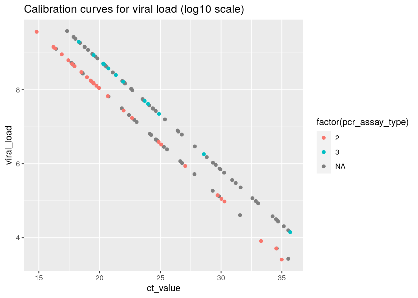 This plot shows that
 viral_load is directly derived from the ct_value through a calibration factor.
PCR Ct values of > 35 are considered as the threshold value for detecting a COVID infection using the PCR test, so the values in this plot make sense for COVID positive samples.
Take some time to appreciate the huge range difference in the samples on display here. From only 10.000 viral particles (\(log_{10}{(10^4)} = 4\) ) to almost 1 billion (\(log_{10}{(10^9)} = 9\) ) particles.
We can also see that apparently, there were two separate PCR assays (test types), each with a separate conversion formula used to obtain the estimated viral load.
(N.b. The missings for pcr_assay_type are because for two of three datasets, it was difficult to extract this information from the PDF file. From the plot, we can conclude that for these datasets, the same two assays were used since the values map onto the same two calibration lines)
Sensitivity of the Antigen test
The dataset contains all samples for which the PCR test was positive. Let’s start by checking the raw percentage of antigen test measurements that are positive as well. This is called the sensitivity of a test.
res <- df_pcr_pos %>%
  summarize(sensitivity = mean(mm_value),
            N = n())

res
## # A tibble: 1 x 2
## sensitivity N
## <dbl> <int>
## 1 0.792 120So for all PCR positive samples, 79.2 % is positive as well. This means that, on average, if we would use the antigen test kit, we have a one in five (20%) probability of not detecting COVID-19, compared to when we would have used the method used by test centers operated by the public health agencies.
This value is slightly lower, but close to what is mentioned in the Roche kit’s leaflet.
Let’s postpone evaluation of this fact for a moment and look a bit closer at the data.
For example, we can example the relationship between viral_load and a positive antigen test result (mm_value = 1):
table(df_pcr_pos$mm_value, df_pcr_pos_np$mm_value)##
## 0 1
## 0 20 5
## 1 5 90set.seed(123)
ggplot(df_pcr_pos, aes(x = viral_load, y = mm_value)) +
geom_jitter(height = 0.1) +
geom_smooth() +
geom_vline(xintercept = c(5.7, 7), col = "red")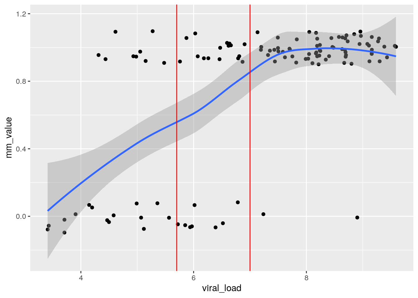
From this plot, we can see that the probability of obtaining a false negative result (mm_value of 0) on the antigen test decreases as the viral load of the PCR sample increases.
From the data we also see that before the antigen test to work about half of the time (blue line at 0.5), the PCR sample needs to contain around \(5 \cdot 10^5\) viral particles (log10 scale 5.7), and for it to work reliably, we need around \(10^7\) particles (“high” viral load) in the PCR sample (which is a combination of oropharyngeal and nasopharyngeal swab). This last bit is important: the researchers did not measure the viral load in the nasal swabs used for the antigen test, these are likely different.
For really high viral loads, above \(10^7\) particles in the NP/OP sample, the probability of a false negative result is only a few percent:
df_pcr_pos %>% filter(viral_load >= 7) %>%
  summarize(sensitivity = mean(mm_value),
            N = n())
## # A tibble: 1 x 2
## sensitivity N
## <dbl> <int>
## 1 0.972 71Viral loads varies with days of symptoms
Above, we already discussed that the viral load varies with the time since infection.
If we want to use the antigen test instead of taking a PCR test, we don’t have information on the viral load. What we often do have is the days since symptoms, and we know that in the first few days of symptoms viral load is highest.
We can check this by plotting the days_of_symptoms versus viral_load:
ggplot(df_pcr_pos, aes(x = days_of_symptoms, y = viral_load)) +
geom_smooth() + expand_limits(x = -4) + geom_vline(xintercept = 1, linetype = "dashed") +
geom_vline(xintercept = c(3, 7), col = "red") + geom_hline(yintercept = 7, col = "grey", linetype = "dashed") +
geom_jitter(height = 0, width = 0.2) 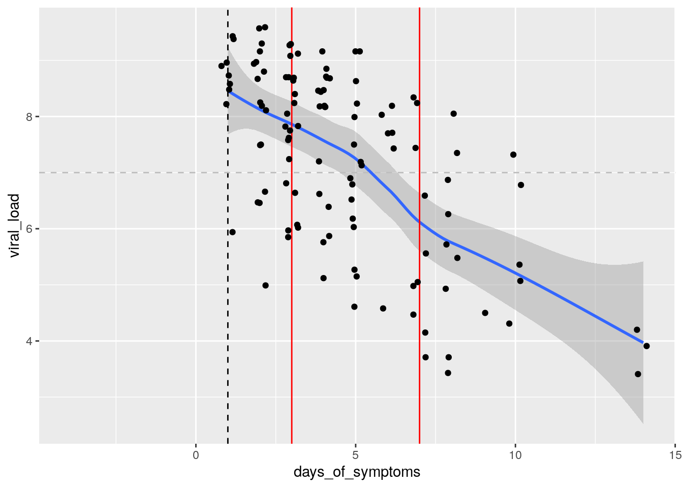 From this plot, we learn that the viral load is highest on the onset of symptoms day (typically 5 days after infection) and decreases afterwards.
Above, we saw that the sensitivity in the whole sample was not equal to the sensitivity mentioned in the leaflet. When evaluating rapid antigen tests, sometimes thresholds for days of symptoms are used, for example <= 3 days or <= 7 days (plotted in red).
For the sensitivity in the leaflet, a threshold of <= 7 days was used on the days of symptoms.
Let us see how sensitive the antigen test is for these subgroups:
res <- df_pcr_pos %>%
  filter(days_of_symptoms <= 3) %>%
  summarize(label = "< 3 days",
            sensitivity = mean(mm_value),
            N = n())

res2 <- df_pcr_pos %>%
  filter(days_of_symptoms <= 7) %>%
  summarize(label = "< 7 days",
            sensitivity = mean(mm_value),
            N = n())

bind_rows(res, res2)
## # A tibble: 2 x 3
## label sensitivity N
## <chr> <dbl> <int>
## 1 < 3 days 0.857 49
## 2 < 7 days 0.85 100The sensitivity in both subgroups is increased to 85.7 % and 85 %. Now only 1 in 7 cases is missed by the antigen test. This sensitivity is now very close to that in the leaflet. The dataset in the leaflet has N = 102, whereas here we have N = 100. Given that the difference is very small, I decided to not look into this any further.
Is there a swab effect?
Ok, so the rapid antigen test is less sensitive than PCR. What about the effect of using self-administered nasal swabs, versus professional health workers taking a nasopharyngeal swab (and often a swab in the back of the throat as well)?
Interestingly, the three Berlin studies all contain a head-to-head comparison of nasal versus nasopharygeal (NP) swabs. Lets have a look, shall we?
The dataset df_pcr_pos_np is identical to df_pcr_pos, but contains the measurement results for the nasopharygeal swabs.
To compare both measurement methods, we can plot the relationship between the probability of obtaining a positive result versus viral load. If one method gathers systematically more viral load from the patient, we expect that method to detect infection at lower patient viral loads, and the curves (nasal vs NP) would be shifted relative to each other.
set.seed(123)

ggplot(df_pcr_pos_np , aes(x = viral_load, y = mm_value)) +
  geom_jitter(data = df_pcr_pos, height = 0.05, col = "blue") +
  geom_jitter(height = 0.05, col = "orange") +
  geom_smooth(data = df_pcr_pos , col = "blue") +
  geom_smooth(col = "orange") +
  ggtitle("nasal (blue) versus nasopharyngeal (orange) swabs")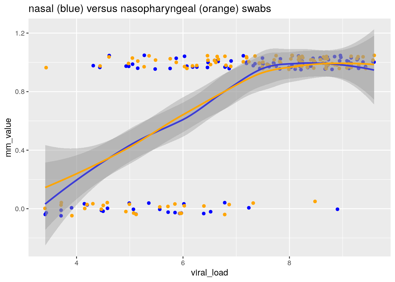
By fitting a smoother through the binary data, we obtain an estimate of the relationship between the probability of obtaining a positive result, and the viral load of the patient as measured by PCR on a combined NP/OP swab.
From this plot, I conclude that:
- The sensitivity of a test is strongly dependent on the distribution of viral loads in the population the measurement was conducted in
- There is no evidence for any differences in sensitivity between nasal and nasopharyngeal swabs
This last conclusion came as a surprise for me, as nasopharygeal swabs are long considered to be the golden standard for obtaining samples for PCR detection of respiratory viruses, such as influenza and COVID-19 (Seaman et al. (2019), (Lee et al. 2021) ). So let’s look a bit deeper still.
Double-check: Rotterdam vs Berlin
We can compare the results from the three Berlin studies with a recent Dutch study that also used the Roche antigen test (ref: Igloi et al. 2021). The study was conducted in Rotterdam, and used nasopharygeal swabs to obtain the sample for the antigen test.
Cool! Lets try and create two comparable groups in both studies so we can compare the sensitivity.
The Igloi et al. paper reports results for a particular subset that we can also create in the Berlin dataset. They report that for the subset of samples with high viral load (viral load \(2.17 \cdot 10^5\) particles / ml = 5.35 on the log10 scale, ct_value <= 30) AND who presented within 7 days of symptom onset, they found a sensitivity of 95.8% (CI95% 90.5-98.2). The percentage is based on N = 159 persons (or slightly less because of not subsetting on <= 7 days of symptoms, the paper is not very clear here).
We can check what the sensitivity is for this subgroup in the Berlin dataset:
df_pcr_pos %>% filter(viral_load >= 5.35 & days_of_symptoms <= 7) %>%
  summarize(sensitivity = mean(mm_value),
            N = n())
## # A tibble: 1 x 2
## sensitivity N
## <dbl> <int>
## 1 0.898 88In the same subgroup of high viral load, sensitivity of the nasal swab test is 6% lower than the nasopharyngeal swab test, across the two studies. But how do we have to weigh this evidence? N = 88 is not so much data, and the studies are not identical in design.
Importantly, since the threshold to be included in this comparison (ct value <= 30, viral_load > 5.35) contains a large part of the region where the probability of a positive result is between 0 and 1, we need to compare the distributions of viral loads for both studies to make an apples to apples comparison.
The Igloi study reports their distribution of viral loads for PCR-positive samples (N=186) in five bins (Table 1 in their paper):
cat <- c("ct <= 20", "ct 20-25", "ct 25-30", "ct 30-35", "ct 35+")
counts <- c(31, 82, 46, 27, 1)
ggplot(data.frame(cat, counts), aes(x = cat, y = counts)) +
geom_col()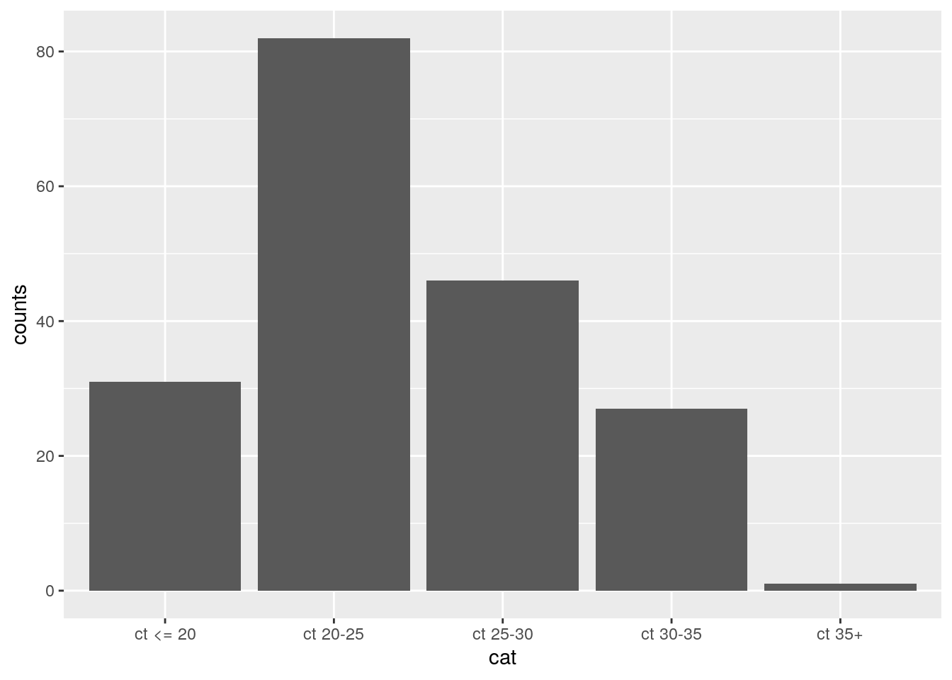 Lets create those same bins in the Berlin dataset as well:
df_pcr_pos$ct_bin <- cut(df_pcr_pos$ct_value, breaks = c(-Inf,20,25,30,35,Inf))

ggplot(df_pcr_pos, aes(x = ct_bin)) +
  geom_histogram(stat = "count")
For the subset where we can compare the sensitivities (ct_value <= 30), the Berlin clinical population has a higher viral load than the Rotterdam clinical population! So that does not explain why the Rotterdam study reports a higher sensitivity.
I use simulation to create distributions of plausible values for the sensitivity, assuming the observed values in both studies (89.7% for the Berlin studies, and 95.8% for the Rotterdam study) to be the true data generating values.
set.seed(123)
# Berlin
sample_size = 88
prior_probability = 0.898
est_p <- rbinom(10000, sample_size, p=prior_probability)/sample_size
# Rotterdam
sample_size2 = 159 # derived from Table 1 (Ct value distribution of PCR+ samples, <= 30)
prior_probability2 = 0.958
est_p2 <- rbinom(10000, sample_size2, p=prior_probability2)/sample_size2
ggplot(data.frame(est_p), aes(x = est_p)) +
geom_histogram(binwidth = 0.005) +
geom_histogram(data = data.frame(est_p = est_p2), fill = "gray60", alpha = 0.5, binwidth = 0.005) +
geom_vline(xintercept = prior_probability, linetype = "dashed", col= "red") +
geom_vline(xintercept = prior_probability2, linetype = "dashed", col= "blue") +
ggtitle("Berlin (black bars) vs Rotterdam (grey bars) sensitivity for higher viral loads")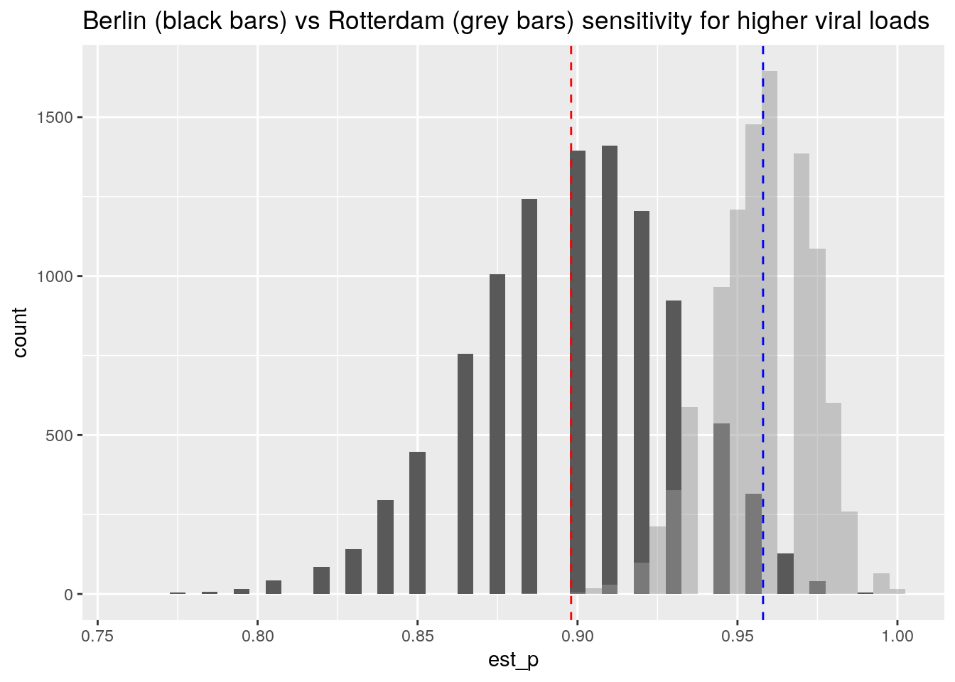 There is a region of overlap between the two distributions, so the difference between the studies could be (in part) attributed to statistical sampling variation for the same underlying process.
I conclude that the Berlin study, who does a head to head comparison of NP versus nasal swabs, finds them to be highly comparable, and reports sensitivities that are close to those reported by the Rotterdam study.
Surprisingly, nasal swabs appear to give results that are comparable to those of nasopharyngeal swabs, while having not having the disadvantages of them (unpleasant, can only be performed by professional health worker).
That other metric: the specificity
So far, the discussion centered around the sensitivity of the test. Equally important is the specificity of the test. This quantifies if the test result of the antigen test is specific for COVID-19. It would be bad if the test would also show a result for other viruses, or even unrelated molecules.
To examine this, we use the aggregated data supplied on the leaflet from the kit, df_leaflet.
N.b. The aggregated data is a subset of all the data from the three studies, because the data was subsetted for cases with <= 7 days_of_symptoms.
This dataset contains for each sample one of four possibilities:
- Both tests are negative,
- both tests are positive,
- the PCR test is positive but the antigen test negative,
- the PCR test is negative but the antigen positive.
We use the yardstick package of R’s tidymodels family to create the 2x2 table and analyze the specificity.
(Overthinking: Note that the yardstick package is used to quantify the performance of statistical prediction models by comparing the model predictions to the true values contained in the training data. This provides us with an analogy where the antigen test can be viewed as a model that is trying the predict the outcome of the PCR test.)
options(yardstick.event_first = FALSE)
conf_matrix <- yardstick::conf_mat(df_leaflet, pcr_result, ag_result)
autoplot(conf_matrix,
type = "heatmap",
title = "Truth = PCR test, Prediction = Antigen test")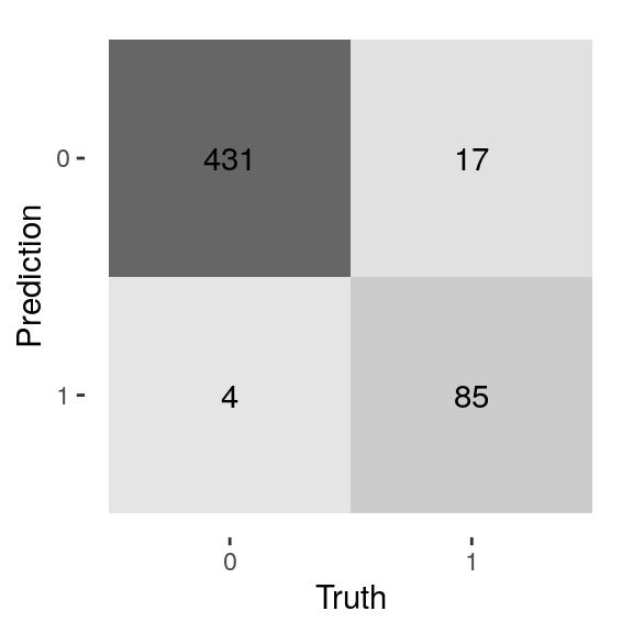 From the heatmap (confusingly called a confusion matrix among ML practioners), we see that:
- For most samples (N = 431), both tests are COVID-19 negative.
- 85 + 17 = 102 samples tested COVID-19 positive using the PCR-test
- 85 out of 102 samples that are PCR positive, are antigen test positive as well
For the specificity, we have to look at the samples where the PCR test is negative, but the antigen test is positive, and compare these to all the samples that are PCR-test negative. These are the number of tests where the antigen test picked up a non-specific signal. One minus this percentage gives the specificity (1 - 4/435 = 431/435):
yardstick::spec(df_leaflet, pcr_result, ag_result)## # A tibble: 1 x 3
## .metric .estimator .estimate
## <chr> <chr> <dbl>
## 1 spec binary 0.991Thus, we find that the antigen test is highly specific, with around 1% of false positives.
Uncertainty in the estimated specificity and sensitivity
So far, we did not discuss the sampling variability in the estimated specificity and sensitivity.
The kit leaflet mentions the following confidence intervals:
- Sensitivity 83.3% (95%CI: 74.7% - 90.0%)
- Specificity 99.1% (95%CI: 97.7% - 99.7%)
The R-package yardstick does not yet include confidence intervals, so I generated these using bootstrapping. I calculate both metrics for 10.000 samples sampled from the raw data. For brevity I omitted the code here, go check out my Github for the R script.
The bootstrapping approach yields the following range of plausible values given the data (95% interval):
quantile(spec_vec, probs = c(0.025, 0.975))## 2.5% 97.5%
## 0.9811765 0.9977477quantile(sens_vec, probs = c(0.025, 0.975))## 2.5% 97.5%
## 0.7570030 0.9029126The amount of data (N = 537) prevents us from getting an exact match to the leaflet’s confidence intervals, that are based on theoretic formulas. But we do get pretty close.
Especially for the sensitivity, there is quite some uncertainty, we see that plausible values range from 76% up to 90% for this particular cohort of cases with this particular mix of viral loads that showed up during the last four months of 2020 in the University hospital in Berlin.
Conclusions
To summarise: we found that the numbers of the kit’s leaflet are reliable, reproducible, and published in full detail in the scientific literature. Hurray!
We also found that even the gold standard PCR is not able to detect all infected persons, it all depends on how much virus is present, and how the sample is obtained.
But all in all, the PCR test is clearly more accurate. Why would we want to use an antigen test then? To do the PCR test you need a lab with skilled people, equipment such as PCR devices and pipets, and time, as the process takes at least a few hours to complete. The advantage of an antigen test is to have a low-tech, faster alternative that can be self-administered. But that comes at a cost, because the antigen tests are less sensitive.
From the analysis, it is clear that the rapid Antigen tests need more virus present to reliably detect infection. It is ALSO clear that the test is highly specific, with less than 1% false positives. Note that a false positive rate of 1% still means that in a healthy population of 1000, 10 are falsely detected as having COVID-19.
Surprisingly, nasal swabs appear to give results that are comparable to those of nasopharyngeal swabs, while having not having the disadvantages of them (unpleasant, can only be performed by professional health worker).
So the antigen tests are less sensitive than PCR tests. But now comes the key insight: the persons that produce the largest amounts of virus get detected, irrespective of whether they have symptoms or not. To me, this seems like a “Unique Selling Point” of the rapid tests: the ability to rapidly detect the most contagious persons in a group, after which these persons can go into quarantine and help reduce spread.
Thanks to dr. Andreas Lindner for providing helpful feedback and pointing out flaws in my original blog post. This should not be seen as an endorsement of the conclusions of this post, and any remaining mistakes are all my own!
References
Head-to-head comparison of SARS-CoV-2 antigen-detecting rapid test with self-collected nasal swab versus professional-collected nasopharyngeal swab: Andreas K. Lindner, Olga Nikolai, Franka Kausch, Mia Wintel, Franziska Hommes, Maximilian Gertler, Lisa J. Krüger, Mary Gaeddert, Frank Tobian, Federica Lainati, Lisa Köppel, Joachim Seybold, Victor M. Corman, Christian Drosten, Jörg Hofmann, Jilian A. Sacks, Frank P. Mockenhaupt, Claudia M. Denkinger, European Respiratory Journal 2021 57: 2003961
Head-to-head comparison of SARS-CoV-2 antigen-detecting rapid test with professional-collected nasal versus nasopharyngeal swab: Andreas K. Lindner, Olga Nikolai, Chiara Rohardt, Susen Burock, Claudia Hülso, Alisa Bölke, Maximilian Gertler, Lisa J. Krüger, Mary Gaeddert, Frank Tobian, Federica Lainati, Joachim Seybold, Terry C. Jones, Jörg Hofmann, Jilian A. Sacks, Frank P. Mockenhaupt, Claudia M. Denkinger European Respiratory Journal 2021 57: 2004430
SARS-CoV-2 patient self-testing with an antigen-detecting rapid test: a head-to-head comparison with professional testing: Andreas K. Lindner, Olga Nikolai, Chiara Rohardt, Franka Kausch, Mia Wintel, Maximilian Gertler, Susen Burock, Merle Hörig, Julian Bernhard, Frank Tobian, Mary Gaeddert, Federica Lainati, Victor M. Corman, Terry C. Jones, Jilian A. Sacks, Joachim Seybold, Claudia M. Denkinger, Frank P. Mockenhaupt, under review, preprint on medrxiv.org
Variation in False-Negative Rate of Reverse Transcriptase Polymerase Chain Reaction–Based SARS-CoV-2 Tests by Time Since Exposure: Lauren M. Kucirka, Stephen A. Lauer, Oliver Laeyendecker, Denali Boon, Justin Lessler Link to paper
Clinical evaluation of the Roche/SD Biosensor rapid antigen test with symptomatic, non-hospitalized patients in a municipal health service drive-through testing site: Zsὁfia Iglὁi, Jans Velzing, Janko van Beek, David van de Vijver, Georgina Aron, Roel Ensing, KimberleyBenschop, Wanda Han, Timo Boelsums, Marion Koopmans, Corine Geurtsvankessel, Richard Molenkamp Link on medrxiv.org
Performance of Saliva, Oropharyngeal Swabs, and Nasal Swabs for SARS-CoV-2 Molecular Detection: a Systematic Review and Meta-analysis: Rose A. Lee, Joshua C. Herigona, Andrea Benedetti, Nira R. Pollock, Claudia M. Denkinger Link to paper
Self-collected compared with professional-collected swabbing in the diagnosis of influenza in symptomatic individuals: A meta-analysis and assessment of validity: Seaman et al 2019 Link to paper
Gertjan Verhoeven
Data Scientist / Policy Advisor
Gertjan Verhoeven is a research scientist currently at the Dutch Healthcare Authority, working on health policy and statistical methods. Follow me on Twitter or Mastodon to receive updates on new blog posts. Statistics posts using R are featured on R-Bloggers.