
Using posterior predictive distributions to get the Average Treatment Effect (ATE) with uncertainty
Gertjan Verhoeven & Misja Mikkers
Here we show how to use Stan with the brms R-package to calculate the posterior predictive distribution of a covariate-adjusted average treatment effect. We fit a model on simulated data that mimics a (very clean) experiment with random treatment assignment.
Introduction
Suppose we have data from a Randomized Controlled Trial (RCT) and we want to estimate the average treatment effect (ATE). Patients get treated, or not, depending only on a coin flip. This is encoded in the Treatment variable. The outcome is a count variable Admissions, representing the number of times the patient gets admitted to the hospital. The treatment is expected to reduce the number of hospital admissions for patients.
To complicate matters (a bit): As is often the case with patients, not all patients are identical. Suppose that older patients have on average more Admissions. So Age is a covariate.
Average treatment effect (ATE)
Now, after we fitted a model to the data, we want to actually use our model to answer "What-if" questions (counterfactuals). Here we answer the following question:
- What would the average reduction in Admissions be if we had treated ALL the patients in the sample, compared to a situation where NO patient in the sample would have received treatment?
Well, that is easy, we just take the fitted model, change treatment from zero to one for each, and observe the ("marginal") effect on the outcome, right?
Yes, but the uncertainty is harder. We have uncertainty in the estimated coefficients of the intercept and covariate, as well as in the coefficient of the treatment variable. And these uncertainties can be correlated (for example between the coefficients of intercept and covariate).
Here we show how to use posterior_predict() to simulate outcomes of the model using the sampled parameters. If we do this for two counterfactuals, all patients treated, and all patients untreated, and subtract these, we can easily calculate the posterior predictive distribution of the average treatment effect.
Let's do it!
Load packages
This tutorial uses brms, a user friendly interface to full Bayesian modelling with Stan.
library(tidyverse)
library(rstan)
library(brms)
Data simulation
We generate fake data that matches our problem setup.
Admissions are determined by patient Age, whether the patient has Treatment, and some random Noise to capture unobserved effects that influence Admissions. We exponentiate them to always get a positive number, and plug it in the Poisson distribution using rpois().
set.seed(123)

id <- 1:200
n_obs <- length(id)
b_tr <- -0.7
b_age <- 0.1

df_sim <- as.data.frame(id) %>%
mutate(Age = rgamma(n_obs, shape = 5, scale = 2)) %>% # positive cont predictor
mutate(Noise = rnorm(n_obs, mean = 0, sd = 0.5)) %>% # add noise
mutate(Treatment = ifelse(runif(n_obs) < 0.5, 0, 1)) %>% # Flip a coin for treatment
mutate(Lambda = exp(b_age * Age + b_tr * Treatment + Noise)) %>% # generate lambda for the poisson dist
mutate(Admissions = rpois(n_obs, lambda = Lambda))
Summarize data
Ok, so what does our dataset look like?
summary(df_sim)## id Age Noise Treatment
## Min. : 1.00 Min. : 1.794 Min. :-1.32157 Min. :0.000
## 1st Qu.: 50.75 1st Qu.: 6.724 1st Qu.:-0.28614 1st Qu.:0.000
## Median :100.50 Median : 8.791 Median : 0.04713 Median :0.000
## Mean :100.50 Mean : 9.474 Mean : 0.02427 Mean :0.495
## 3rd Qu.:150.25 3rd Qu.:11.713 3rd Qu.: 0.36025 3rd Qu.:1.000
## Max. :200.00 Max. :24.835 Max. : 1.28573 Max. :1.000
## Lambda Admissions
## Min. : 0.2479 Min. : 0.000
## 1st Qu.: 1.1431 1st Qu.: 1.000
## Median : 1.8104 Median : 2.000
## Mean : 2.6528 Mean : 2.485
## 3rd Qu.: 3.0960 3rd Qu.: 3.000
## Max. :37.1296 Max. :38.000The Treatment variable should reduce admissions. Lets visualize the distribution of Admission values for both treated and untreated patients.
ggplot(data = df_sim, aes(x = Admissions)) +
  geom_histogram(stat="count") +
facet_wrap(~ Treatment) 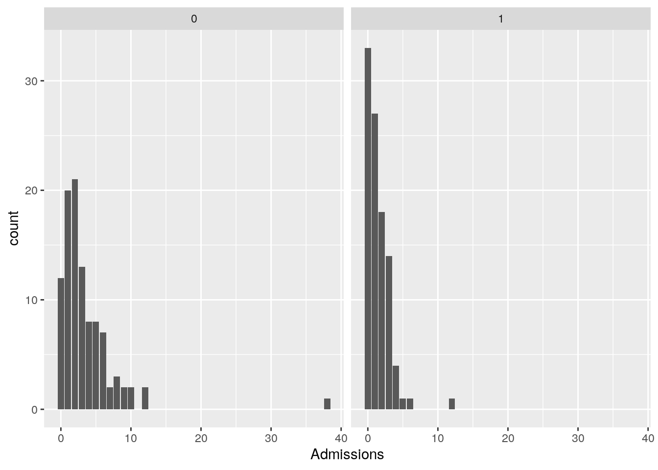
The effect of the treatment on reducing admissions is clearly visible.
We can also visualize the relationship between Admissions and Age, for both treated and untreated patients. We use the viridis scales to provide colour maps that are designed to be perceived by viewers with common forms of colour blindness.
ggplot(data = df_sim, aes(x = Age, y = Admissions, color = as.factor(Treatment))) +
  geom_point() +
  scale_color_viridis_d(labels = c("No Treatment", "Treatment")) +
  labs(color = "Treatment")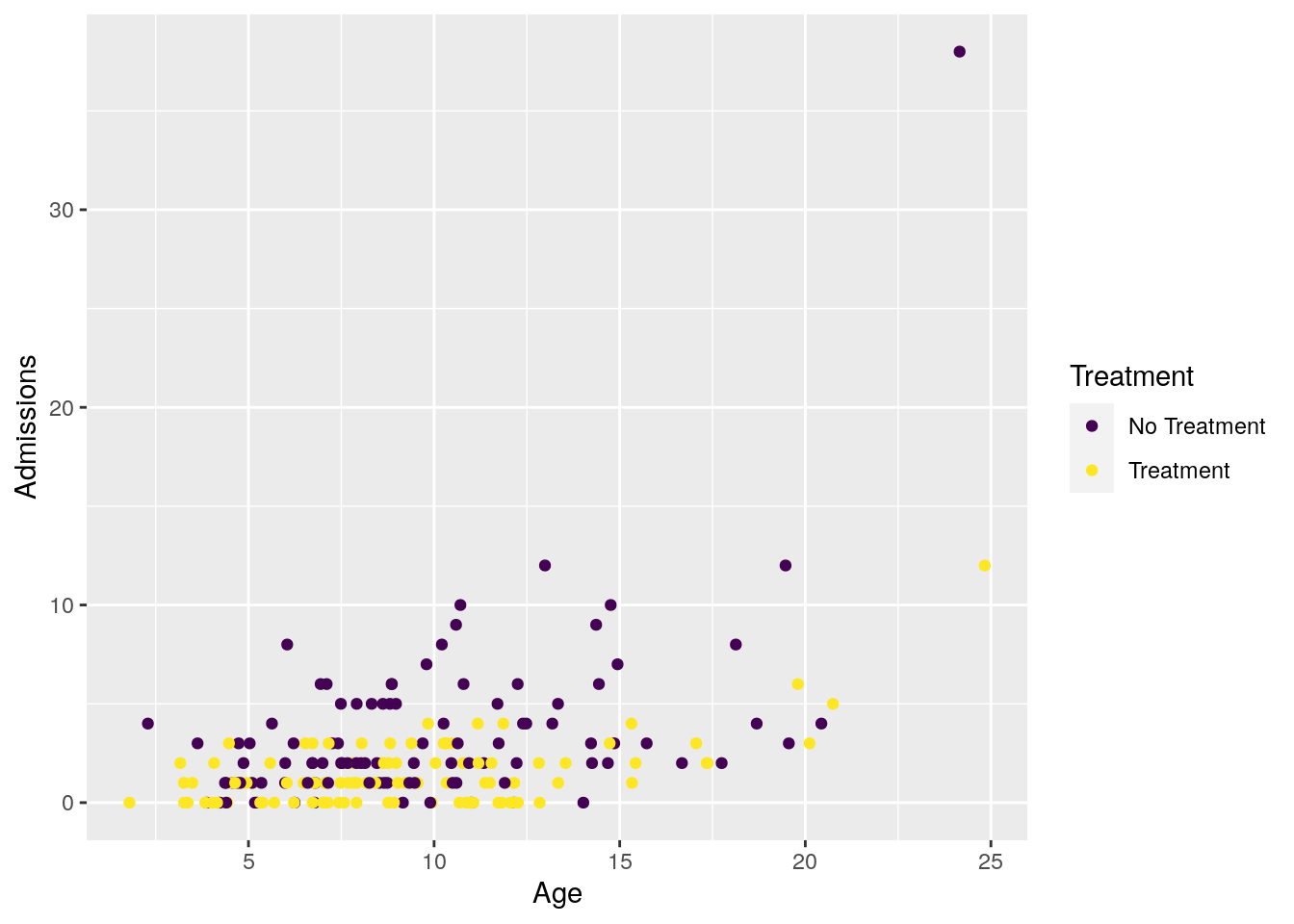
Now lets fit our Bayesian Poisson regression model to it.
Fit model
We use brms default priors for convenience here. For a real application we would of course put effort into into crafting priors that reflect our current knowledge of the problem at hand.
model1 <- brm(
  formula = as.integer(Admissions) ~  Age + Treatment,
   data = df_sim,
  family = poisson(),
  warmup = 2000, iter = 5000,
  cores = 2,
  chains = 4,
  seed = 123,
  silent = TRUE,
  refresh = 0,
)
## Compiling Stan program...## Start samplingCheck model fit
summary(model1)## Family: poisson
## Links: mu = log
## Formula: as.integer(Admissions) ~ Age + Treatment
## Data: df_sim (Number of observations: 200)
## Samples: 4 chains, each with iter = 5000; warmup = 2000; thin = 1;
## total post-warmup samples = 12000
##
## Population-Level Effects:
## Estimate Est.Error l-95% CI u-95% CI Rhat Bulk_ESS Tail_ESS
## Intercept -0.05 0.12 -0.28 0.18 1.00 7410 7333
## Age 0.12 0.01 0.10 0.14 1.00 8052 8226
## Treatment -0.83 0.10 -1.02 -0.63 1.00 7794 7606
##
## Samples were drawn using sampling(NUTS). For each parameter, Bulk_ESS
## and Tail_ESS are effective sample size measures, and Rhat is the potential
## scale reduction factor on split chains (at convergence, Rhat = 1).We see that the posterior dists for \(\beta_{Age}\) and \(\beta_{Treatment}\) cover the true values, so looking good. To get a fuller glimpse into the (correlated) uncertainty of the model parameters we make a pairs plot:
pairs(model1)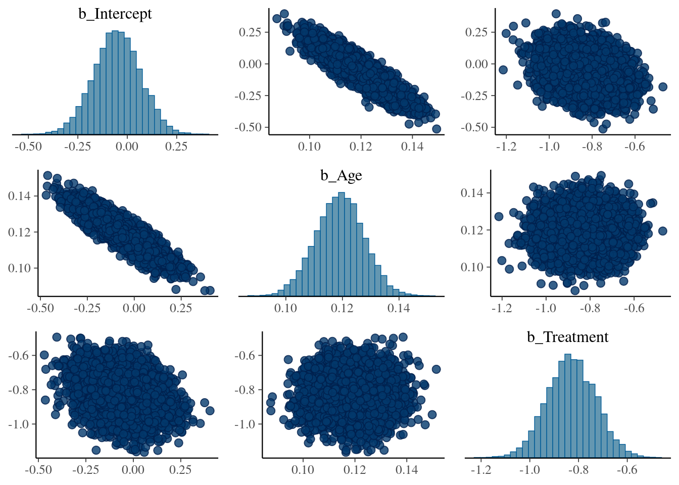
As expected, the coefficients \(\beta_{Intercept}\) (added by brms) and \(\beta_{Age}\) are highly correlated.
First attempt: Calculate Individual Treatment effects using the model fit object
Conceptually, the simplest approach for prediction is to take the most likely values for all the model parameters, and use these to calculate for each patient an individual treatment effect. This is what plain OLS regression does when we call predict.lm() on a fitted model.
est_intercept <- fixef(model1, pars = "Intercept")[,1]
est_age_eff <- fixef(model1, pars = "Age")[,1]
est_t <- fixef(model1, pars = "Treatment")[,1]

# brm fit parameters (intercept plus treatment)
ites <- exp(est_intercept + (est_age_eff * df_sim$Age) +  est_t) - exp(est_intercept + (est_age_eff * df_sim$Age))

ggplot(data.frame(ites), aes(x = ites)) +
  geom_histogram() +
  geom_vline(xintercept = mean(ites), col = "red") +
  ggtitle("Effect of treatment on Admissions for each observation") +
expand_limits(x = 0) 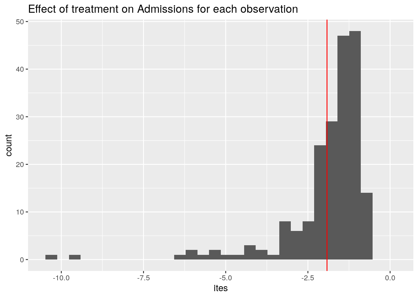
Averaging the ITEs gives us the ATE, displayed in red.
Ok, so on average, our treatment reduces the number of Admissions by -1.9.
You may wonder: why do we even have a distribution of treatment effects here? Should it not be the same for each patient? Here a peculiarity of the Poisson regression model comes to surface: The effect of changing Treatment from 0 to 1 on the outcome depends on the value of Age of the patient. This is because we exponentiate the linear model before we plug it into the Poisson distribution.
Next, the uncertainty in the ATE
How to get all this underlying, correlated uncertainty in the model parameters, that have varying effects depending on the covariates of patients, and properly propagate that to the ATE? What is the range of plausible values of the ATE consistent with the data & model?
At this point, using only the summary statistics of the model fit (i.e. the coefficients), we hit a wall. To make progress we have to work with the full posterior distribution of model parameters, and use this to make predictions. That is why it is often called "the posterior predictive distribution" (Check BDA3 for the full story).
Posterior predictive distribution (PPD): two tricks
Ok, you say, a Posterior Predictive Distribution, let's have it! Where can I get one?
Luckily for us, most of the work is already done, because we have fitted our model. And thus we have a large collection of parameter draws (or samples, to confuse things a bit). All the correlated uncertainty is contained in these draws.
This is the first trick. Conceptually, we imagine that each separate draw of the posterior represents a particular version of our model.
In our example model fit, we have 12.000 samples from the posterior. In our imagination, we now have 12.000 versions of our model, where unlikely parameter combinations are present less often compared to likely parameter combinations. The full uncertainty of our model parameters is contained in this "collection of models" .
The second trick is that we simulate (generate) predictions for all observations, from each of these 12.000 models. Under the hood, this means computing for each model (we have 12.000), for each observation (we have 200) the predicted lambda value given the covariates, and drawing a single value from a Poisson distribution with that \(\Lambda\) value (e.g. running rpois(n = 1, lambda) ).
This gives us a 12.000 x 200 matrix, that we can compute with.
Computing with the PPD: brms::posterior_predict()
To compute PPD's, we can use brms::posterior_predict(). We can feed it any dataset using the newdata argument, and have it generate a PPD.
For our application, the computation can be broken down in two steps:
- Step 1: use
posterior_predict()on our dataset withTreatmentset to zero, do the same for our dataset withTreatmentset to one, and subtract the two matrices. This gives us a matrix of outcome differences / treatment effects. - Step 2: Averaging over all cols (the N=200 simulated outcomes for each draw) should give us the distribution of the ATE. This distribution now represents the variability (uncertainty) of the estimate.
Ok, step 1:
# create two versions of our dataset, with all Tr= 0 and all Tr=1
df_sim_t0 <- df_sim %>% mutate(Treatment = 0)

df_sim_t1 <- df_sim %>% mutate(Treatment = 1)

# simulate the PPDs
pp_t0 <- posterior_predict(model1, newdata = df_sim_t0)

pp_t1 <- posterior_predict(model1, newdata = df_sim_t1)

diff <- pp_t1 - pp_t0

dim(diff)
## [1] 12000 200And step 2 (averaging by row over the cols):
ATE_per_draw <- apply(diff, 1, mean)

# equivalent expression for tidyverse fans
#ATE_per_draw <- data.frame(diff) %>% rowwise() %>% summarise(avg = mean(c_across(cols = everything())))

length(ATE_per_draw)
## [1] 12000Finally, a distribution of plausible ATE values. Oo, that is so nice. Lets visualize it!
ggplot(data.frame(ATE_per_draw), aes(x = ATE_per_draw)) +
  geom_histogram() +
  geom_vline(xintercept = mean(ites), col = "red") +
  ggtitle("Posterior distribution of the Average Treatment Effect (ATE)")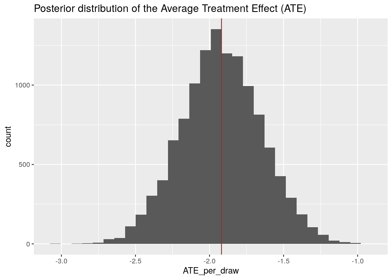
We can compare this distribution with the point estimate of the ATE we obtained above using the model coefficients. It sits right in the middle (red line), just as it should be!
Demonstrating the versatility: uncertainty in the sum of treatment effects
Now suppose we are a policy maker, and we want to estimate the total reduction in Admissions if all patients get the treatment. And we want to quantify the range of plausible values of this summary statistic.
To do so, we can easily adjust our code to summing instead of averaging all the treatment effects within each draw (i.e. by row):
TTE_per_draw <- apply(diff, 1, sum)

ggplot(data.frame(TTE_per_draw), aes(x = TTE_per_draw)) +
  geom_histogram() +
  geom_vline(xintercept = sum(ites), col = "red") +
  ggtitle("Posterior distribution of the Total Treatment Effect (TTE)")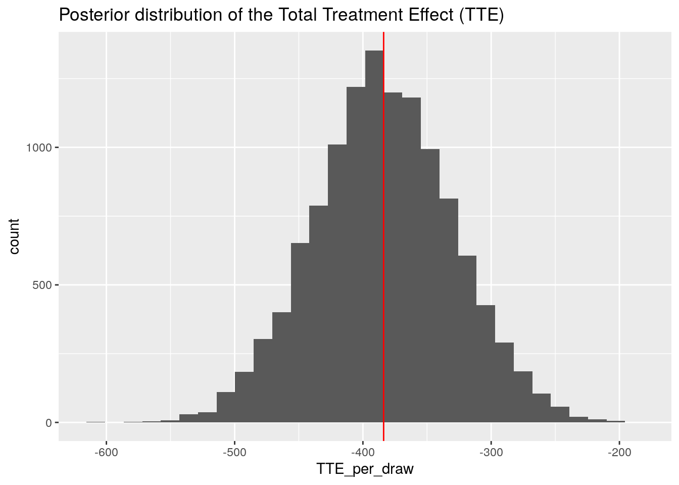
So our model predicts for the aggregate reduction of patient Admissions a value in the range of -500 to -250.
This distribution can then be used to answer questions such as "what is the probability that our treatment reduces Admissions by at least 400"?
TTE <- data.frame(TTE_per_draw) %>%
  mutate(counter = ifelse(TTE_per_draw < -400, 1, 0))

mean(TTE$counter) * 100
## [1] 38.1Take home message: PPD with brms is easy and powerful
We hope to have demonstrated that when doing a full bayesian analysis with brms and Stan, it is very easy to create Posterior Predictive Distributions using posterior_predict(). And that if we have a posterior predictive distribution, incorporating uncertainty in various "marginal effects" type analyses becomes dead-easy. These analyses include what-if scenarios using the original data, or scenarios using new data with different covariate distributions (for example if we have an RCT that is enriched in young students, and we want to apply it to the general population). Ok, that it is for today, happy modelling!
Gertjan Verhoeven
Data Scientist / Policy Advisor
Gertjan Verhoeven is a research scientist currently at the Dutch Healthcare Authority, working on health policy and statistical methods. Follow me on Twitter or Mastodon to receive updates on new blog posts. Statistics posts using R are featured on R-Bloggers.