Exploring Process Mining in R
In this post, we'll explore the BupaR suite of Process Mining packages created by Gert Janssenswillen from Hasselt University.
We start with exploring the patients dataset contained in the eventdataR package. According to the documentation, this is an "Artifical eventlog about patients".
Getting started
After installing all required packages, we can load the whole "bupaverse" by loading the bupaR package.
library(ggplot2)
library(bupaR)
## Warning in library(package, lib.loc = lib.loc, character.only = TRUE,
## logical.return = TRUE, : there is no package called 'xesreadR'## Warning in library(package, lib.loc = lib.loc, character.only = TRUE,
## logical.return = TRUE, : there is no package called 'processmonitR'## Warning in library(package, lib.loc = lib.loc, character.only = TRUE,
## logical.return = TRUE, : there is no package called 'petrinetR'library(processmapR)Now, our dataset is already in eventlog format, but typically this not the case. Here's how to turn a data.frame into an object of class eventlog:
patients <- eventdataR::patients

df <- eventlog(patients,
               case_id = "patient",
               activity_id = "handling",
               activity_instance_id = "handling_id",
               lifecycle_id = "registration_type",
               timestamp = "time",
               resource_id = "employee")
## Warning: The `add` argument of `group_by()` is deprecated as of dplyr 1.0.0.
## Please use the `.add` argument instead.
## This warning is displayed once every 8 hours.
## Call `lifecycle::last_warnings()` to see where this warning was generated.Let's check it out.
summary(df)## Number of events: 5442
## Number of cases: 500
## Number of traces: 7
## Number of distinct activities: 7
## Average trace length: 10.884
##
## Start eventlog: 2017-01-02 11:41:53
## End eventlog: 2018-05-05 07:16:02## handling patient employee handling_id
## Blood test : 474 Length:5442 r1:1000 Length:5442
## Check-out : 984 Class :character r2:1000 Class :character
## Discuss Results : 990 Mode :character r3: 474 Mode :character
## MRI SCAN : 472 r4: 472
## Registration :1000 r5: 522
## Triage and Assessment:1000 r6: 990
## X-Ray : 522 r7: 984
## registration_type time .order
## complete:2721 Min. :2017-01-02 11:41:53 Min. : 1
## start :2721 1st Qu.:2017-05-06 17:15:18 1st Qu.:1361
## Median :2017-09-08 04:16:50 Median :2722
## Mean :2017-09-02 20:52:34 Mean :2722
## 3rd Qu.:2017-12-22 15:44:11 3rd Qu.:4082
## Max. :2018-05-05 07:16:02 Max. :5442
## So we learn that there are 500 "cases", i.e. patients. There are 7 different activities.
Let's check out the data for a single patient:
df %>% filter(patient == 1) %>%
  arrange(handling_id) #%>%
## Log of 12 events consisting of:
## 1 trace
## 1 case
## 6 instances of 6 activities
## 6 resources
## Events occurred from 2017-01-02 11:41:53 until 2017-01-09 19:45:45
##
## Variables were mapped as follows:
## Case identifier: patient
## Activity identifier: handling
## Resource identifier: employee
## Activity instance identifier: handling_id
## Timestamp: time
## Lifecycle transition: registration_type
##
## # A tibble: 12 x 7
## handling patient employee handling_id registration_ty… time
## <fct> <chr> <fct> <chr> <fct> <dttm>
## 1 Registr… 1 r1 1 start 2017-01-02 11:41:53
## 2 Registr… 1 r1 1 complete 2017-01-02 12:40:20
## 3 Blood t… 1 r3 1001 start 2017-01-05 08:59:04
## 4 Blood t… 1 r3 1001 complete 2017-01-05 14:34:27
## 5 MRI SCAN 1 r4 1238 start 2017-01-05 21:37:12
## 6 MRI SCAN 1 r4 1238 complete 2017-01-06 01:54:23
## 7 Discuss… 1 r6 1735 start 2017-01-07 07:57:49
## 8 Discuss… 1 r6 1735 complete 2017-01-07 10:18:08
## 9 Check-o… 1 r7 2230 start 2017-01-09 17:09:43
## 10 Check-o… 1 r7 2230 complete 2017-01-09 19:45:45
## 11 Triage … 1 r2 501 start 2017-01-02 12:40:20
## 12 Triage … 1 r2 501 complete 2017-01-02 22:32:25
## # … with 1 more variable: .order <int> # select(handling, handling_id, registration_type) # does not workWe learn that each "handling" has a separate start and complete timestamp.
Traces
The summary info of the event log also counts so-called "traces". A trace is defined a unique sequence of events in the event log. Apparently, there are only seven different traces (possible sequences). Let's visualize them.
To visualize all traces, we set coverage to 1.0.
df %>% processmapR::trace_explorer(type = "frequent", coverage = 1.0)## Warning: `rename_()` is deprecated as of dplyr 0.7.0.
## Please use `rename()` instead.
## This warning is displayed once every 8 hours.
## Call `lifecycle::last_warnings()` to see where this warning was generated.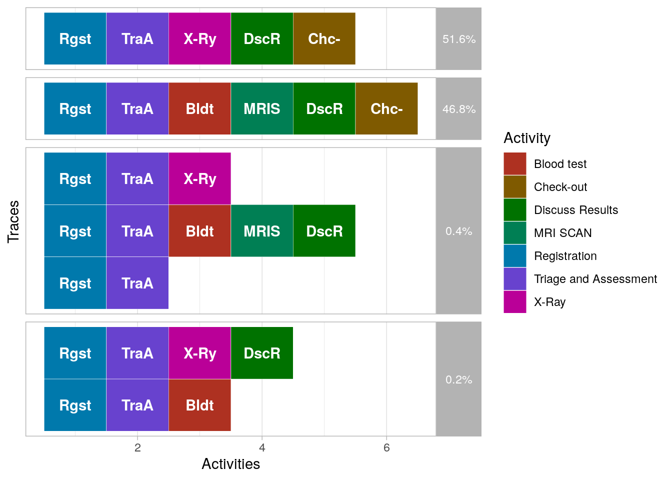 So there are a few traces (0.6%) that do not end with a check-out. Ignoring these rare cases, we find that there are two types of cases:
- Cases that get an X-ray
- Cases that get a blood test followed by an MRI scan
The dotted chart
A really powerful visualization in process mining comes in the form of a "dotted chart". The dotted chart function produces a ggplot graph, which is nice, because so we can actually tweak the graph as we can with regular ggplot objects.
It has two nice use cases. The first is when we plot actual time on the x-axis, and sort the cases by starting date.
df %>% dotted_chart(x = "absolute", sort = "start") + ggtitle("All cases") +
  theme_gray()
## Joining, by = "patient"
The slope of this graphs learns us the rate of new cases, and if this changes over time. Here it appears constant, with 500 cases divided over five quarter years.
The second is to align all cases relative to the first event, and sort on duration of the whole sequence of events.
df %>% dotted_chart(x = "relative", sort = "duration") + ggtitle("All cases") +
  theme_gray()
## Joining, by = "patient"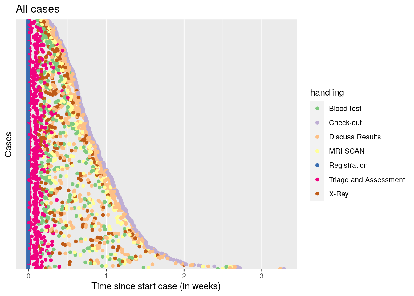
A nice pattern emerges, where all cases start with registration, then quickly proceed to triage and assessment, after that, a time varying period of 1-10 days follows where either the blood test + MRI scan, or the X-ray is performed, followed by discussing the results. Finally, check out occurs.
Conclusion
To conclude, the process mining approach to analyze time series event data appears highly promising. The dotted chart is a great addition to my data visualization repertoire, and the process mining folks appear to have at lot more goodies, such as Trace Alignment.
Gertjan Verhoeven
Data Scientist / Policy Advisor
Gertjan Verhoeven is a research scientist currently at the Dutch Healthcare Authority, working on health policy and statistical methods. Follow me on Twitter or Mastodon to receive updates on new blog posts. Statistics posts using R are featured on R-Bloggers.