Classifying Blood Bowl teams using clustered heatmaps
(Photo by Erik Cats)
“If you graph the numbers of any system, patterns emerge” is one of my favorite movie quotes (from Darren Aronofsky’s cult movie about mathematics \(\pi\) (“pi”)). In this post we’ll graph the numbers from the Blood Bowl Fantasy football game, and see what patterns emerge. Blood Bowl is a board game that can be summarized as “fantasy-chess-with-dice”, but this would hardly do the game justice. For example, in chess both players play with the same pieces, but in Blood Bowl, almost 30 different teams (e.g. orcs, elves, etc) are available to choose from, each team with different skills that require different playing styles. In addition, Blood Bowl coaches must assemble and paint their playing pieces themselves, making it a creative hobby as well.
For this blog post, we have a look at similarities and differences between the different Blood Bowl 2020 teams, and see where the newly introduced Black Orc and Khorne teams fit in. Using data analysis, we can cluster teams that have similar (average) match performance statistics and graph the data using heatmaps.
Heatmaps are a graphical representation of the data, with for example darker colors representing higher numbers. This allows patterns to emerge visually, and deviations on the patterns are also easy to spot. (Fun fact: a hundred years ago, people already “shaded matrices” but did not call it a heatmap yet (Wilkinson and Friendly 2009).)
We use match performance data from FUMBBL.com where Blood Bowl 2020 can be played online. For a previous blog post that describes the process of scraping the data see here. I made the match data (currently from August 2020 up to June 2022) publicly available in a Github repository.
Team play style categories
The most common way to classify the 25-30 different Blood Bowl teams is to distinguish four categories:
- Bash (e.g. Orcs)
- Agile (or Dash) (e.g. Wood Elf)
- Hybrid (e.g. Humans)
- Stunty (e.g. Halflings)
To formally classify a team we can use the follow decision tree, taking as input the most common roster choices for a team:
- Does the team roster have a lot of Stunty players and a few Big Guys with negatrait?
- yes classify as Stunty
- no continue
- Does the team roster have 4+ players with Strength skill access but < 4 players with Agility access?
- yes classify as Bash
- no continue
- Does the team roster have 4+ players with Agility skill access but < 4 players with Strength access?
- yes classify as Agile / Dash
- no classify as Hybrid
As an example, Shambling Undead are typically played with 2 wights and 2 mummies (4 players with Strength access), but also with four Ghoul runners (4 players with Agility access), so this team is classified as Hybrid.
Main source for this scheme is (Dode 2017), but the bash/dash/hybrid/stunty categorization is widespread, for example at (Breidr 2015), (Amiral 2017) and (Schlice 2018).
It will be interesting to compare the patterns in the data with this categorization. In the next section we’ll discuss the various match statistics available from FUMBBL, but first we need to prep the data.
Read and prep the data
We start with reading in the scraped FUMBBL match data, see my previous blog posts mentioned above for details.
# Load packages
library(tidyverse)
library(ggfortify)
library(ggrepel)
df_mbt <- read.csv(file = "../../../fumbbl_datasets/datasets/current/df_mbt.csv")
race_types <- unique(df_mbt %>%
select(race_name, race_type) %>%
filter(race_type != "") %>%
arrange(race_type))This blog post focusses on the Blood Bowl 2020 ruleset, for this we need the “Competitive” division from FUMBBL. (I performed the analysis for the older divisions using the 2016 ruleset as well, the plots can be found at the end of this blog post. )
A blog post from Schlice (Schlice 2018) got me interested in BB team classification using data. In his post, he makes heavy use of functional programming using R’s purrr package. This allows us to write a function and have this function work in parallel on a list of objects, and have it return the results also in list form.
As this was new to me, I decided to adapt his code to process the four divisions simultaneously. To do so, I wrote a function filter_division() that takes the source data and selects only matches from a particular division:
divisions <- c("Competitive", "Blackbox", "Ranked", "Regular_league")

filter_division <- function(div_name){
  df_mbt %>%
  filter(division_name == div_name) %>%
  filter(race_name != "Treeman") %>%
  filter(race_name != "Simyin")
}

data_tables <- purrr::map(divisions, filter_division)
names(data_tables) <- divisions
data_tables now contains a list of four datasets, one for each division.
Next step is to select the variables we are interested in.
Again we use the purrr::map() function to apply our selection function at once to all four datasets:
select_stats <- function(df) {
  df %>%
  select(race_name, race_type, team_score, away_team_score:away_cas_rip) %>%
  select(-(home_cas_bh:home_cas_rip), -(away_cas_bh:away_cas_rip))
}

data_tables <- map(data_tables, select_stats)
We end up with the following set of variables:
data_tables$Competitive %>% colnames()## [1] "race_name" "race_type" "team_score" "away_team_score"
## [5] "home_comp" "home_pass" "home_rush" "home_block"
## [9] "home_foul" "home_cas" "away_comp" "away_pass"
## [13] "away_rush" "away_block" "away_foul" "away_cas"A quick summary of the FUMMBL match statistics
The match statistics that are made available by FUMBBL are all related to important events during Blood Bowl gameplay. Of course, teams with similar stats can still be different on some aspect not captured in the data, so we keep that in mind.
The most obvious one is scoring Touchdowns (team_score and away_team_score). As this involves getting the ball in the end zone of the opposing player, stats for actions that contribute to scoring such as passing the ball are also present. There is the number of completed passes (home_comp and away_comp) as well as the net passing distance (with distance towards the opposing endzone counted positive and counted negative for passes in the opposite direction) (home_pass and away_pass). As passing is risky, running the ball into the endzone is the most common way to score. For running with the ball FUMBBL has the rushing statistic. This name was chosen some 20 years ago, and now may lead to confusion as under the BB2020 rules moving extra squares is called “rushing” (previously called “Going-for-it” or GFI).
The rushing statistic is described in a 2004 (!) FUMBBL forum post by SkiJunkie (the author of the predecessor of FUMBBL):
running/passing in the wrong direction counts negative.
So if you run one step forward then one step back, your net rushing is 0.

Running/passing up and down neither adds nor subtracts. Getting pushed/thrown does not count.
Only movement made during the players move who has the ball counts.

So, you can end up with negative rushing/passing.
This is great! The rushing statistic captures both ball possession as well as the maximum movement of typical ball handlers in each team. For example, in a Skaven team, the ball is typically handled by Gutter Runners, that have a maximum movement of 9. Compare this to the Dwarf team, where the Dwarf runner only has movement 6.
Finally, we have the statistics related towards taking out opposing players. This involves blocking, leading to blocking casualties, as well as fouling (illegally hitting players that are already down). For blocking, the total number of blocks thrown is tracked (home_block and away_block), for casualties we have the number of players who suffer a casualty (home_cas , away_cas) and for fouling we have the number of fouls performed by each team (home_foul, away_foul). For casualties, we use both the number of casualties inflicted as well as casualties suffered (home_cas and away_cas). The average amount of casualties suffered quantifies the vulnerability of a team, and will likely be related to the average armour value (AV) of a team.
As we are interested in statistics at the team level (not for individual matches), we take the average of all the statistics by team:
divisions <- c("Competitive", "Blackbox", "Ranked", "Regular_league")

df_agg <- data_tables$Competitive %>%
  group_by(race_name, race_type) %>%
  summarise(Blocks = mean(home_block),
            Completions = mean(home_comp),
            Fouls = mean(home_foul),
            Distance_passed = mean(home_pass),
            Running_w_ball = mean(home_rush),
            Cas_inflicted = mean(home_cas),
            Cas_suffered = mean(away_cas),
            Touchdowns = mean(team_score),
            size = n())
## `summarise()` has grouped output by 'race_name'. You can override using the
## `.groups` argument.dim(df_agg)## [1] 28 11This gives us 11 numbers for 28 different BB2020 teams.
So which teams have similar stats?
Next, we want to compare the different Blood Bowl teams on their match statistics with each other, and see which races have comparable stats.
If we have only one statistic, it is easy: we can just plot the different teams on one axis, the value of the statistic on the other axis, sort them and see which races are closest by.
Lets do that for the number of blocks made:
options(dplyr.summarise.inform = FALSE)
ggplot(df_agg, aes(x = reorder(race_name, Blocks), y = Blocks, size = size, col = race_type)) +
geom_point() + scale_size_area() + coord_flip() + labs(x = "team name")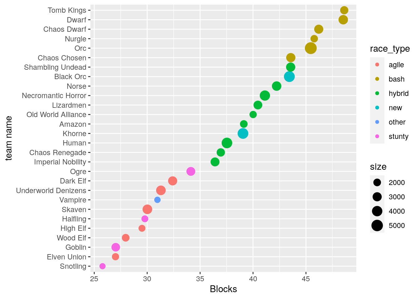 The different colors visualize the Team classification described above.
We can see that the average number of blocks is already pretty predictive of team type.
But races can be similar if we look at blocks, but dissimilar if we look at e.g. passing. So lets make a few plots with each plot comparing two different metrics (code hidden for readability):
library(patchwork)

(p1 | p2)/(p3 | p4) / (p5 | plot_spacer()) +   plot_layout(guides = 'collect')
## `geom_smooth()` using formula 'y ~ x'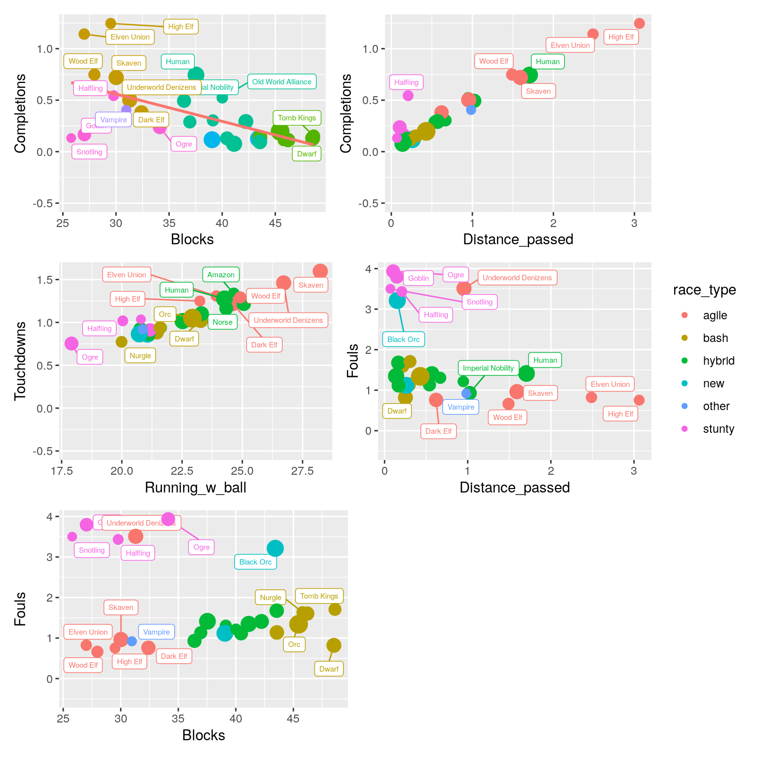
Looking at the plots, we can see that there are clear patterns here. Some metrics are inherently related: Teams that make more passes during a match also cover more passing distance, that is only logical. But there are also patterns that are related to what makes teams different: teams that make more blocks tend to pass less (because they are less good at it).
Given these patterns, we also see teams that do not conform to the pattern: For example, in the top left plot, the Goblin and Snotling teams tend to make less blocks, but also less passes compared to other teams. And for the top middle plot we see that Halflings are an exception: Given how much they pass, we would expect a higher passing distance. (A quick look at their roster explains this: Halflings have dedicated Catchers (making passing attractive), but also the Stunty trait, making long distance passes more risky, decreasing the average passing distance).
Finally, which teams are similar depends on which plot we look at! Take for example the Black Orc team: Based on fouling and distance passed (Bottom left plot), it is very similar to the four Stunty teams. However, In the plot that combines Fouls and Blocks (lower right), it suddenly becomes unique!
PCA versus clustered heatmaps
So how can we compare the teams on all stats simultaneously? We can try to reduce the number of variables by looking at correlations between variables. For example, we observed a strong (negative) correlation between the number of blocks and the number of passes. We could take these two variables together and map (“project”) each team on a single new “axis” (the straight line in the top left plot). For this a commonly used technique is PCA (“principal component analysis”). The original variables are combined into “principle components” along which the most variation occurs. A nufflytics blog post by Schlice (Schlice 2018) applies this technique to classify the Blood Bowl teams of the online Blood Bowl 2 variant of the game. Another example of this approach is the master thesis project of Tadas Ivanauskas (Ivanauskas 2020).
With PCA, a common approach is to focus on the first two principal components, as these can be visualized on a 2D coordinate system (i.e. a scatter plot). However, a big disadvantage of PCA is that the new dimensions are difficult to interpret, because the original data is transformed and combined, and therefore no longer recognizable. In the above mentioned blog post, this becomes apparent when the author puts in serious effort to understand the first four principal components, see his “diving deeper” follow up post. Because each component is a (different) linear combination of ALL 17 variables (!), interpreting the principal components becomes very difficult. To do so requires a high cognitive load, and it is unclear where the signal ends and noise starts.
An attractive alternative is performing a cluster analysis on the original data, and using the cluster order to directly visualize the data as a heatmap. This technique is called clustered heatmaps, and is widely used in bioinformatics to display patterns in data.
Two of the most popular clustering algorithms are Hierarchical clustering and k-means clustering. For example we can ask the computer to cluster the 28 teams into e.g. 5 clusters using the K-means algorithm. This assigns each team to one of \(k = 5\) clusters, with the cluster centers chosen such that teams within a cluster are close by the cluster center and far away from the other cluster centers. However, this forces us to pick the number of clusters, AND it does not provide information on team similarity WITHIN a cluster.
Clustered heatmaps for the win
Hierarchical clustering circumvents both drawbacks as it clusters ALL the observations in such a way that the most similar observations end up next to each other, and thus provide a complete ordering of all observations. All that remains is to plot the data in this order on a colored grid, and BAM the patterns hit us right between the eyes!
The basic functionality to make a heatmap is provided in the R package ggplot2 by the geom_tile() geometric object.
Many wrapper functions around geom_tile() exist to make clustered heatmaps, however they all combine the clustering step with the plotting step.
I am currently experimenting with my own wrapper function ggorder_heatmap(), which I turned into an R package called ggoheatmap. See for details the GitHub repository for the ggoheatmap R package.
Note that it is unstable, under development, and possible not even a good idea, so do not use it yourself.
Instead use pheatmap by Raivo Kolde, available from CRAN, with the official repo here.
library(ggoheatmap)varnames <- c("Blocks", "Fouls", "Cas_inflicted", "Distance_passed", "Completions", "Running_w_ball", "Cas_suffered")
yorder <- data.frame(yorder = 1:length(varnames), variable = varnames)
df_long <- df_agg %>%
pivot_longer(cols = !c(race_name, race_type, size), names_to = "variable") %>%
group_by(variable) %>%
mutate(sd_value = scale(value)) %>%
left_join(yorder, by = "variable")
df_long <- ggoheatmap::hclust_order(df_long,
xvar = "race_name",
yvar = "variable",
value_var = "value",
clust_method = "complete",
dist_method = "euclidean")library(patchwork)
p1 <- ggplot(df_long, aes(x = reorder(race_name, cluster_order), y = 1, fill = race_type)) +
geom_tile() +
coord_flip() +
labs(x = "", y = NULL) +
scale_y_discrete(labels = NULL, breaks = NULL)
p2 <- ggorder_heatmap(df_long,
xvar = "race_name",
yvar = "variable",
col_var = "sd_value",
order_var = "cluster_order",
yorder_var ="yorder",
legend = FALSE,
label_var = "value", round.digits = 1) + coord_flip() +
scale_y_discrete(position = "right")
p1 + p2 +
plot_layout(widths = c(1, 6), guides = "collect") +
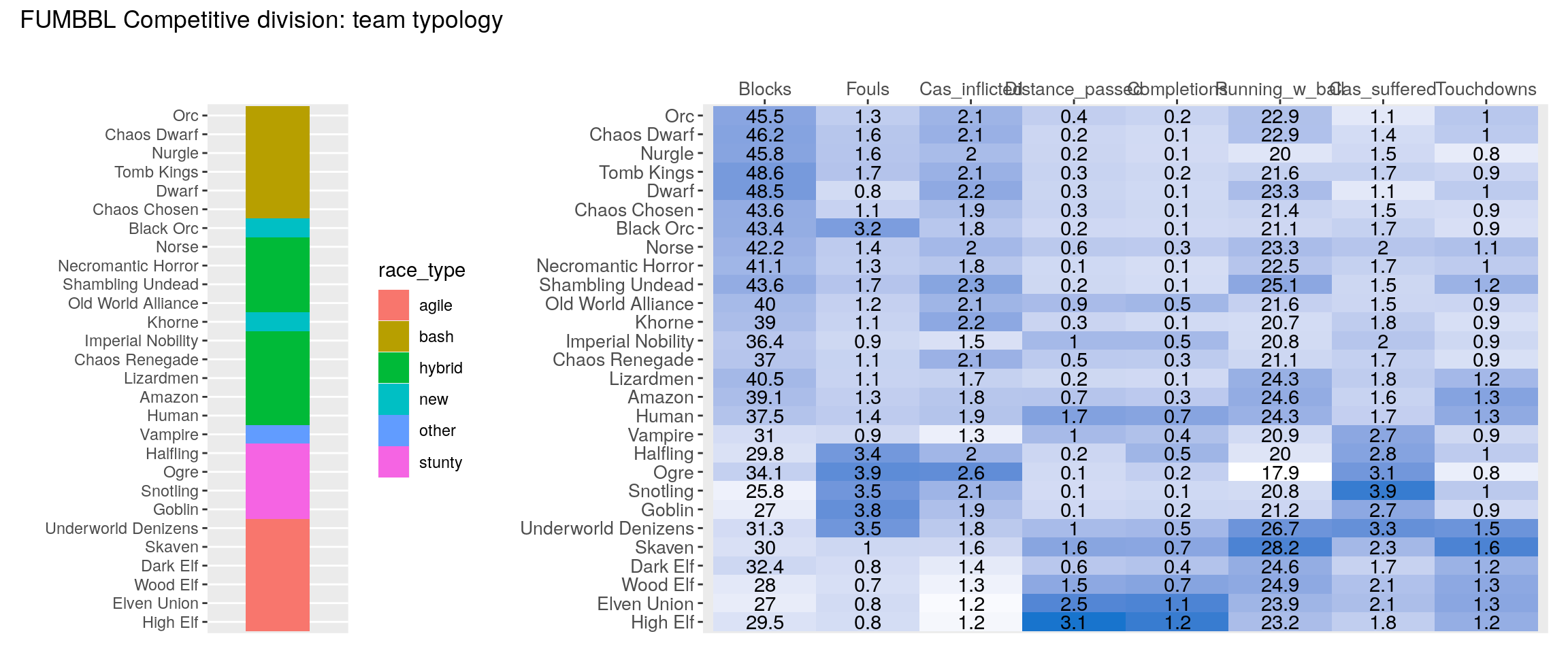
plot_annotation(title = 'BB2020 team typology')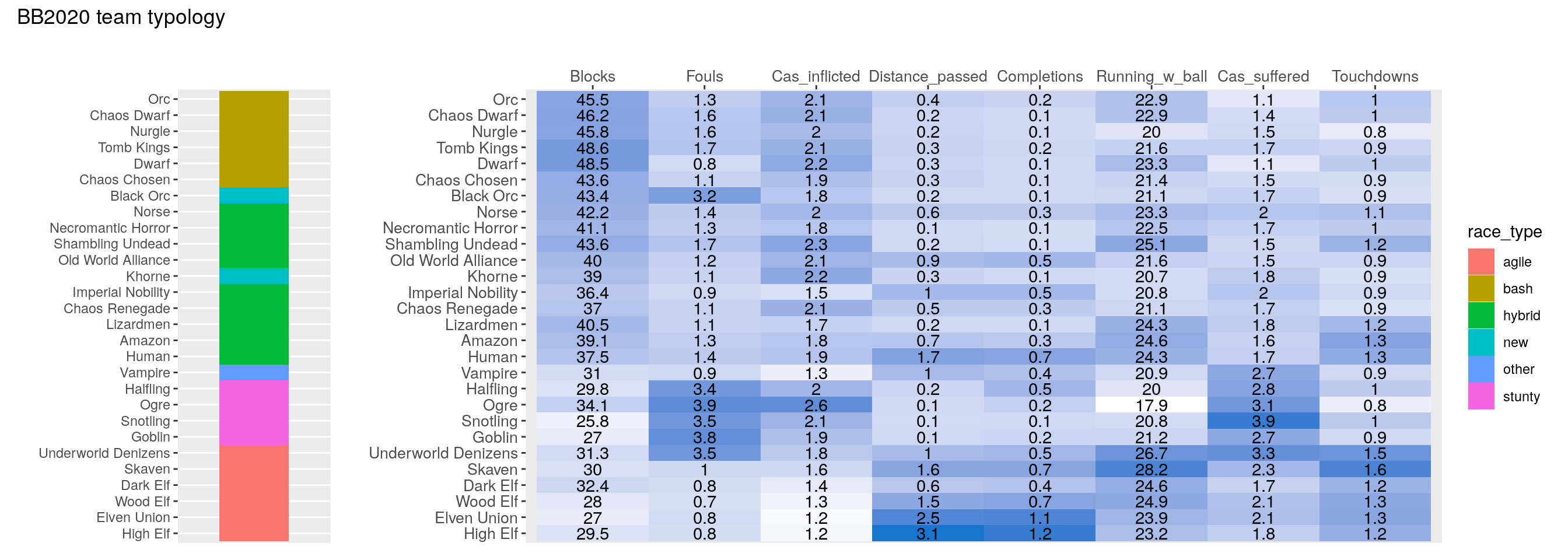 And there we have it, our main result.
First, we see that the existing team categorization does a good job, with the different categories showing different patterns in the match statistics. Note that I did not pre-specify the sort order here, it emerged naturally from the match statistics by the hierarchical clustering algorithm. So the quote from the Pi movie was correct (at least for Blood Bowl): we graphed the numbers, and patterns emerged!
What else can we learn from this plot? The difference between Bash and Hybrid appears not so clear cut: for example: Are Norse (the old BB2020 roster, not the new one) and Chaos Chosen bash or hybrid? Agile and Stunty teams on the other hand are very distinct. Underworld Denizens are an interesting edge case: In BB2020, they cluster right in between Goblin and Skaven teams, I ended up classifying them as Agile. Finally, it is apparent that Vampires indeed are a category of their own.
Conclusions
And now for the question we set out to answer: Where do the new Khorne and Black Orc teams fit in?
Khorne are clearly a hybrid team (because of the lack of skills and frenzy reduces base contact and thus blocks). Black Orcs appear to be quite unique, being a combination of Bashy Hybrid and Fouling.
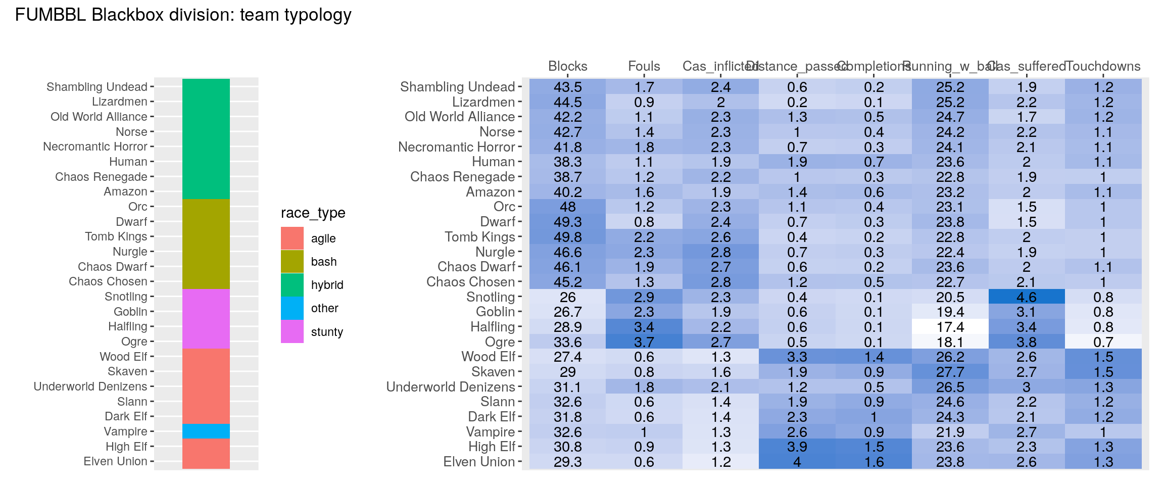
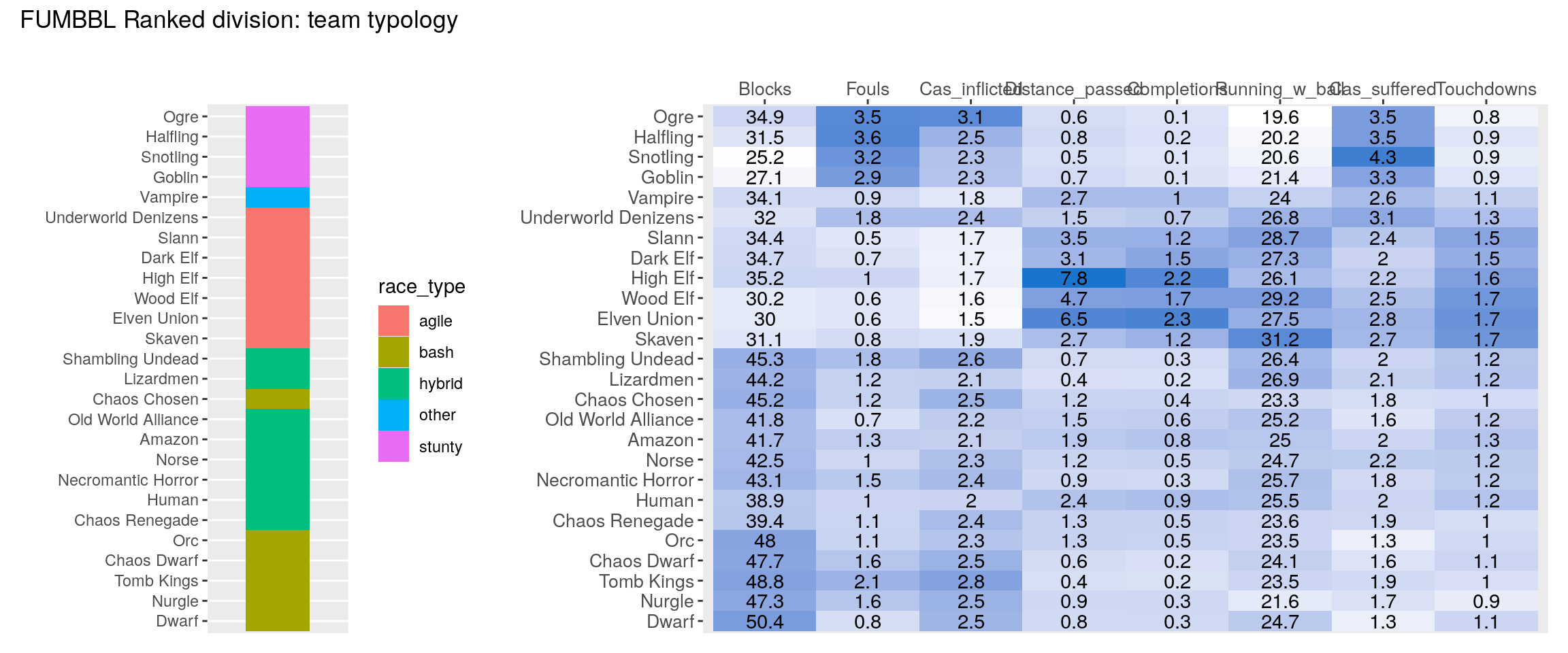
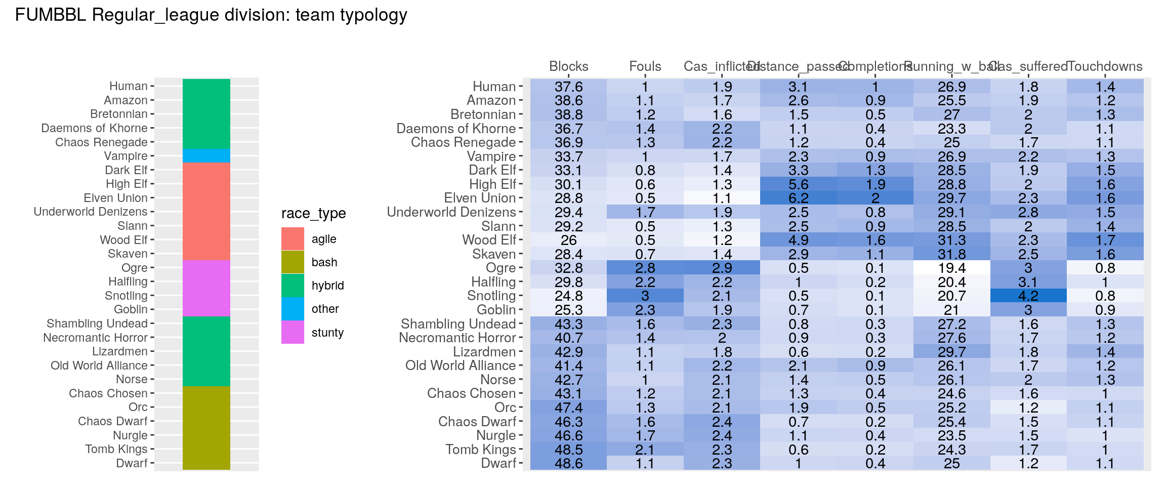
Finally we produce the clustered heatmap for all four divisions:
source("heatmap_post/make_heatmap.R")

for(i in 1:length(divisions)){
  print(make_heatmap(data_tables[[divisions[i]]], division_name = divisions[i]))
}